UI/UX Design project, converting an existing, non-intuitive legacy LAN-based software product, into a new, user-friendly Web-based product.
The existing interface that frustrated users and needed replacing
My Role & Responsibilities
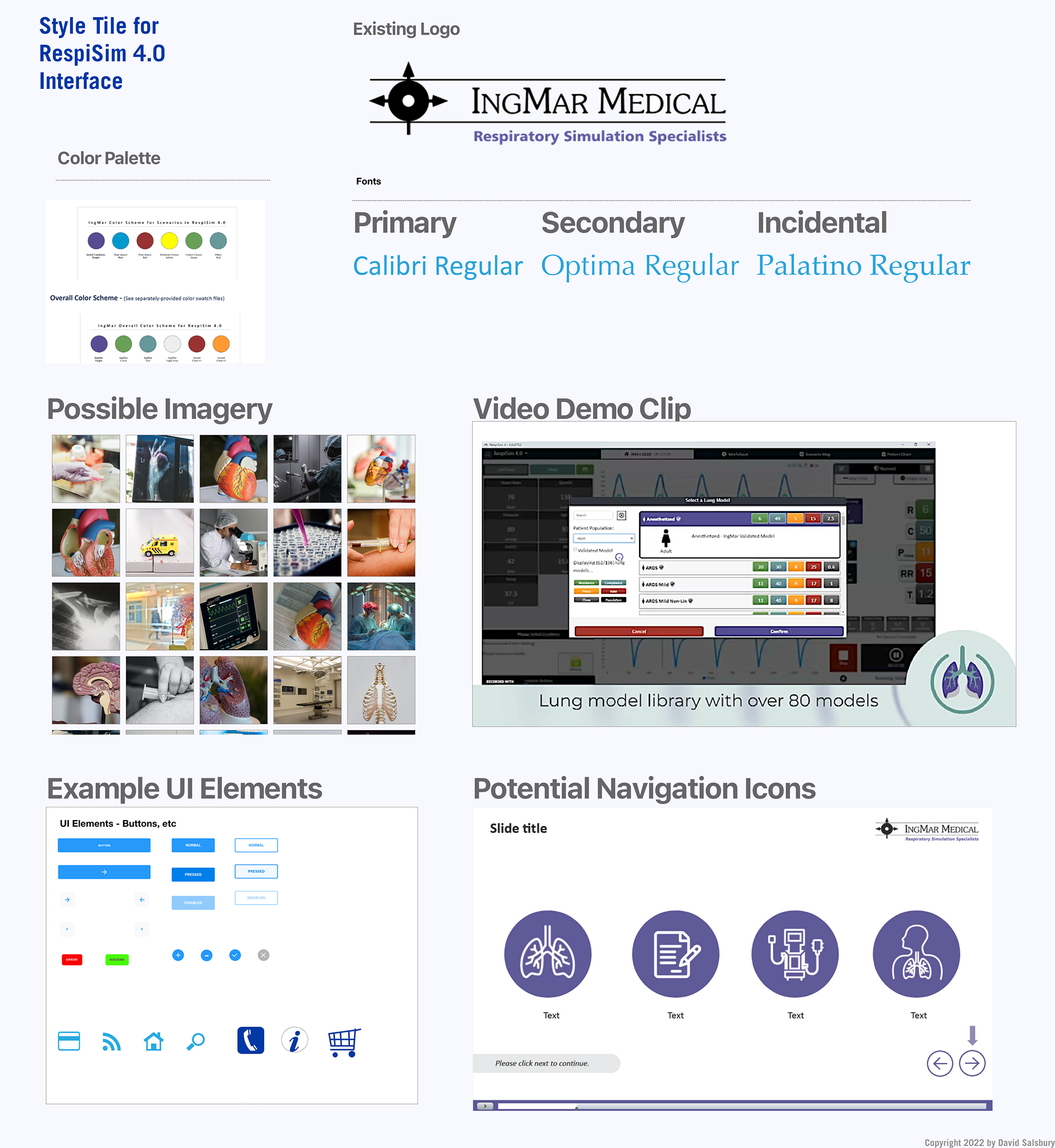
UI Designer/Art Director/Brand Manager. Accountable for creating the visual look & feel for the UI, and ensuring that the final product was brand-compliant, in terms of using company-branded logos, fonts, colors, etc. I worked closely with the technical development team, product manager, and engineers.
Project Length 1 Year
Methodologies Iterative design process, by which prototype designs were created, feedback gathered from internal stakeholders, initially, then at a later stage we also engaged several key existing customers as “beta testers” to gain further insight.
Tools Adobe Photoshop, Illustrator, Acrobat
What are the business goals?
To retain existing customers & gain new business.
To retain existing customers & gain new business.
Target Audience
Respiratory medical professionals who need professional training on the simulated management of ventilator machines for hospitals, such that they become licensed before being allowed to work with actual patients in a clinical setting.
Respiratory medical professionals who need professional training on the simulated management of ventilator machines for hospitals, such that they become licensed before being allowed to work with actual patients in a clinical setting.
Research insight
Existing customer were frustrated by trying to learn & use the simulation software. Even after company-provided training, there was often a need for an inordinate amount of tech support.
Existing customer were frustrated by trying to learn & use the simulation software. Even after company-provided training, there was often a need for an inordinate amount of tech support.
Key user needs
Easy-to-use & easy-to-learn computer-based medical simulation software.
Easy-to-use & easy-to-learn computer-based medical simulation software.
Pain points to address
Existing interface was very hard to understand and had a steep learning curve, as it was designed by engineers, not visual professionals, attuned to the needs of non-technical audience.
Existing interface was very hard to understand and had a steep learning curve, as it was designed by engineers, not visual professionals, attuned to the needs of non-technical audience.
Process
Initially conducted UX testing via white boarding and prototyping sessions internally. Then, we used existing 5 key customers as beta testers, for further feedback, comparing the old vs. the new interfaces & features. This was accomplished by allowing the beta users to access pre-release versions of the new software. The clinical team managed this process, & gathered user feedback, that was then funneled back to the development team.
There were multiple design iterations with internal stakeholders and 3-5 iterations with the beta users for us to get to the final product.
As a team we used a web-based review process, initially using Atlassian Confluence. We then migrated over to a more centralized platform, using MicroSoft SharePoint, which allowed for a more consolidated repository for the reviews, assets, as well as allowing for an automated review process, built-in to SharePoint. This became necessary, due to our move to a fully remote-based company workforce with the advent of Covid in March 2020. However, this also had the unseen effect of increased efficiency, by streamlining the overall process.
RespiSim 4.0 Wireframe

Benefits of the new design
This screen is the main dashboard view, where users now go to begin a simulation exercise. On the left-hand side of the screen, are displayed key ventilator machine settings for the simulation. The center of the screen displays real-time waveform information, representing the breathing of the manikin patient. To the right, the lungs image is a clickable area, where users may interact to change key respiratory settings for the simulation on-the-fly. These are color-coded for easier recognition and recall.
This was the final design of the main home screen for the new UI
Reflection
Looking back, I would have definitely used an actual UI design & prototyping tool, such as Adobe XD or Sketch, had I known about them at the time. As it would have made the UI development process much easier and more efficient.
In spite of that, the project was a good first experience with the UI/UX design & development process, and the resulting end product was a quantum leap beyond the original version, resulting in improved customer satisfaction, a reduction in the amount of technical support calls and better retention.
More importantly, this new version greatly benefited the sales team, as they now had a much better and more modern product U/UX, designed to entice new customers into adopting the product, thus improving the bottom line for the company, as this is their flagship product.